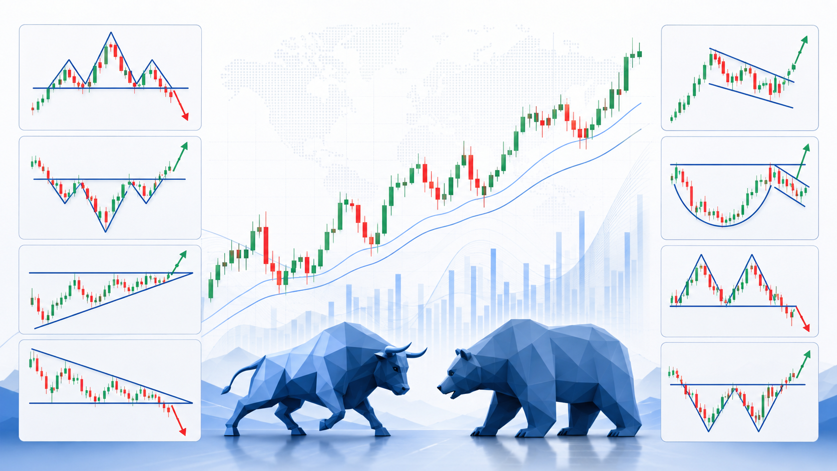
Chart patterns are actually traces that the market leaves behind. They are not a prophecy, a promise, or a magic formula, but they can help us understand what the market is trying to say.
What is a chart pattern?
A chart pattern is a structure that repeats itself in price movement. When the price of a stock, index, currency, or commodity moves over time, areas of increases, decreases, retracements, breakouts, and breaks are formed on the chart.
Technical traders try to identify these structures to assess what may happen next.
For example:
When a stock rises, stops, retraces, and then breaks back up, it may be a continuation of a positive trend.
On the other hand, when a stock rises, repeatedly fails in the same price area, and then starts to fall, buyers may be weakening and sellers are starting to take over.
The Three Main Market Conditions
Before identifying patterns, it is important to understand that the market is usually in one of three conditions:
1. Uptrend
In an uptrend, the price creates higher highs and higher lows. That is, every time the price drops, buyers come back earlier and push it to a new high.
This is a situation where the main power lies with the buyers.
2. Downtrend
In a downtrend, the price creates lower highs and lower lows. Any attempt at recovery is stopped by a lower price, and then another decline comes.
This is a situation where sellers control the market.
3. Shuffle
In a shuffle, the price moves within a relatively clear range between a support and resistance area. There is no clear direction, and the market is essentially “deliberating.”
In many cases, a shuffle is a transitional stage before a stronger movement up or down.
Support and Resistance The Basis of All Chart Reading
You can’t understand chart patterns without understanding two basic concepts: support and resistance.
Support
Support is a price area where buyers tend to enter the action. The price falls to a certain area, and there is demand that prevents it from falling further.
You can think of support as a temporary floor.
Resistance
Resistance is a price area where sellers tend to appear. The price rises to a certain area, and there are sellers or profit-taking that stop the rise.
You can think of resistance as a temporary ceiling.
When a price breaks through significant resistance, it may indicate that buyers are gaining strength. When a price breaks through support, it may indicate that sellers are gaining strength.
Common chart pattern
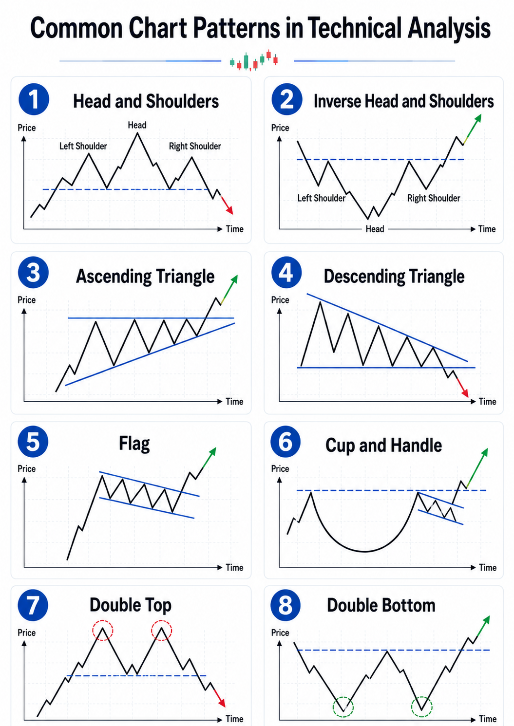
1. Head and Shoulders Pattern
The head and shoulders pattern is one of the most famous reversal patterns in technical analysis.
It usually forms after an uptrend, and consists of three peaks:
Left shoulder — first peak
Head — higher peak
Right shoulder — another peak, lower than the head and sometimes similar to the left shoulder
Between the lows of the pattern is a line called the “neckline”. When the price breaks the neckline downwards, this may signal a change in trend from up to down.
The psychological meaning is simple: buyers managed to create a new peak at the head, but in the next attempt they were no longer able to restore the strength. This is a possible sign of buyer fatigue.
2. Inverted head and shoulders
This is the opposite version of the pattern, and it usually appears after a downtrend.
Instead of three highs, there are three lows:
Left shoulder — first low
Head — lower low
Right shoulder — another low, but higher than the head
When the price breaks the neckline upwards, this may signal a change in trend from down to up.
Here the message is that the sellers tried to lower the price to a new low, but in the next attempt they were no longer successful. Buyers are starting to come back into the picture.
3. Ascending triangle
Ascending triangle is often considered a positive continuation pattern.
It is formed when there is a horizontal resistance area, but the lows are getting higher. That is, the sellers stop the price again and again in the same area, but the buyers are becoming more aggressive and are willing to buy at higher prices.
When the price breaks the resistance upwards, this may signal a continuation of the uptrend.
4. Descending triangle
A descending triangle is the mirror image of an ascending triangle.
There is a horizontal support area, but the highs are getting lower. That is, buyers are still defending a certain area, but sellers are increasingly pressing from above.
When the price breaks support downwards, this may signal a continuation of the decline.
5. Flag
A flag is a classic continuation pattern.
It appears after a sharp and rapid price movement — either up or down — followed by a small correction or narrow shuffle that looks like a flag.
If there was a strong rise and then a slight shuffle, a breakout to the upside may indicate a continuation of the move.
If there was a strong decline and then a small correction, a breakout to the downside may indicate a continuation of the decline.
The idea here is that the market “rests” after a strong move, before continuing in its original direction.
6. Cup and Handle Pattern
A cup and handle pattern is usually considered a positive continuation pattern.
The cup is formed when the price gradually falls, stabilizes, and then goes back up towards the previous high. This is followed by a “handle” — a small correction or short shuffle.
When the price breaks the resistance zone of the cup, it may signal a continuation of the rise.
This is a pattern that expresses a process of gathering goods, a gradual recovery, and then an attempt to break through.
7. Double Top Double Top
A double top is a negative reversal pattern.
It is formed when the price rises to a resistance zone, falls, and then returns to the same zone again but fails to break through it. Then, if the price breaks the low between the two peaks, a possible signal for a trend change is received.
Meaning: Buyers tried to break up twice and failed. The second failure may attract new sellers to the market.
8. Double Bottom Double Bottom
A double bottom is a positive reversal pattern.
It is formed when the price falls to a support zone, rises, and then returns to the same zone again but fails to break through it. If the price then breaks the high between the two bottoms, a possible signal for a trend change to the upside is received.
The message here is that sellers have tried twice to break support and failed. Buyers are starting to take over.
Trading Volume The Element You Shouldn’t Ignore
A chart pattern alone is not enough. One of the most important things is to check the trading volume.
A breakout up with high volume is considered more reliable than a breakout with low volume.
A breakout down with high volume may indicate significant selling pressure.
On the other hand, a breakout without volume may be a “false breakout.”
Trading volume helps us understand whether there is real market participation behind the move, or whether it is a weak and unsupported move.
False breakouts The classic trap
One of the common mistakes of novice traders is to buy immediately as soon as the price breaks resistance, or sell immediately as soon as it breaks support.
But the market is not always “clean.” Sometimes the price breaks out for a moment, draws traders in, and then quickly returns to the previous range.
This is called a false breakout.
Therefore, many traders wait for further confirmation, for example:
Closing candle above resistance
High trading volume
Retest of breakout zone
Combination with broader trend
Confirmation from additional technical indicators
How to work with chart patterns correctly?
The professional way is not to ask “Does the pattern always work?”, but to ask:
What is the reward-risk ratio?
Where is the entry point?
Where is the stop?
What is the reasonable target?
Does the trading volume support the move?
Does the pattern align with the main trend?
Does the overall market support the direction of the trade?
A good chart pattern is not just a pretty picture on the screen. It needs to be integrated into a clear trading plan.
Risk management is more important than the pattern
Even the most beautiful pattern can fail. Therefore, risk management is an integral part of technical analysis.
Before each trade, it is important to know in advance:
How much am I willing to lose?
Where do I exit if the scenario does not work?
What is the correct position size?
Does the risk-reward ratio justify the trade?
A professional trader does not try to be right in every trade. He is trying to build a system in which the profits on good trades are greater than the losses on trades that didn't work.
Common Mistakes in Reading Patterns
One of the biggest mistakes is to see patterns everywhere. Sometimes the chart is just noisy, directionless, and not clean enough.
Another mistake is to ignore the market context. A positive pattern in a weak stock while the entire market is falling sharply is less reliable than a positive pattern in a leading stock while the market is rising.
Another mistake is entering too late. Sometimes the trader correctly identifies the pattern, but enters after the move has already occurred. In such a case, the risk-reward ratio becomes less attractive.
Summary
Chart patterns are an important tool in the technical trader's toolbox. They help to understand the power struggle between buyers and sellers, identify situations of trend continuation or trend reversal, and build an organized plan of action.
But it is important to remember: patterns are not certainties. They are probabilities. To use them correctly, they must be combined with trend, support and resistance, trading volume, risk management, and execution discipline.
Ultimately, good technical analysis is not just about knowing how to identify a pattern on a chart. It's about knowing how to read the story behind the price and react to it in a cool, professional, and calculated manner.
Have a take on this?
Jump into the TradeTechAI Discord to discuss this article with other traders.
Written by
David Rodriguez
Technical Analysis Specialist
David Rodriguez is a contributor at TradeTechAI, covering market analysis, trading strategies, and portfolio insights.